Design System for Security & Privacy Startup
Building consistency and speed into product development
With rapid product expansion, UI inconsistencies and duplicated components began slowing both design and engineering. Chroma introduced structure: reusable tokens, shared layout logic, and standardized data components. The result — faster releases, fewer UI bugs, and a scalable foundation for future features.
Overview
As the product scaled from MVP to a multi-feature platform, the need for a unified design language became critical. Visual inconsistencies, duplicated UI patterns, and manual handoff processes were slowing down delivery and increasing design and engineering debt.
Chroma was introduced as a scalable atomic design system — standardizing tokens, components, and interaction logic across all product surfaces. The result: faster releases, fewer UI bugs, and a strong foundation for future growth.
Problem
Rapid product expansion created several core challenges:
UI components were being rebuilt differently across teams
No shared source of truth for spacing, colors, typography, or states
Accessibility and responsive behavior were handled inconsistently
Engineering velocity dropped due to repeated redesign + refactor cycles
UX fragmentation resulted in higher cognitive load for users
Without a system, every new feature increased UI debt instead of scaling the product.
Solution
We built Chroma - an atomic design system that unified UI patterns and accelerated delivery:
Reusable design tokens
Standardized components from atoms to full pages
Shared layout rules for complex data UIs
The result: faster shipping, less rework, and a consistent product experience at scale.
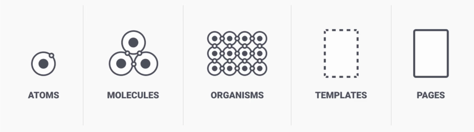
Atomic design
Prisma’s design system is based on Brad Frost’s Atomic Design, which breaks down the UI into simple building blocks, from small components to full pages
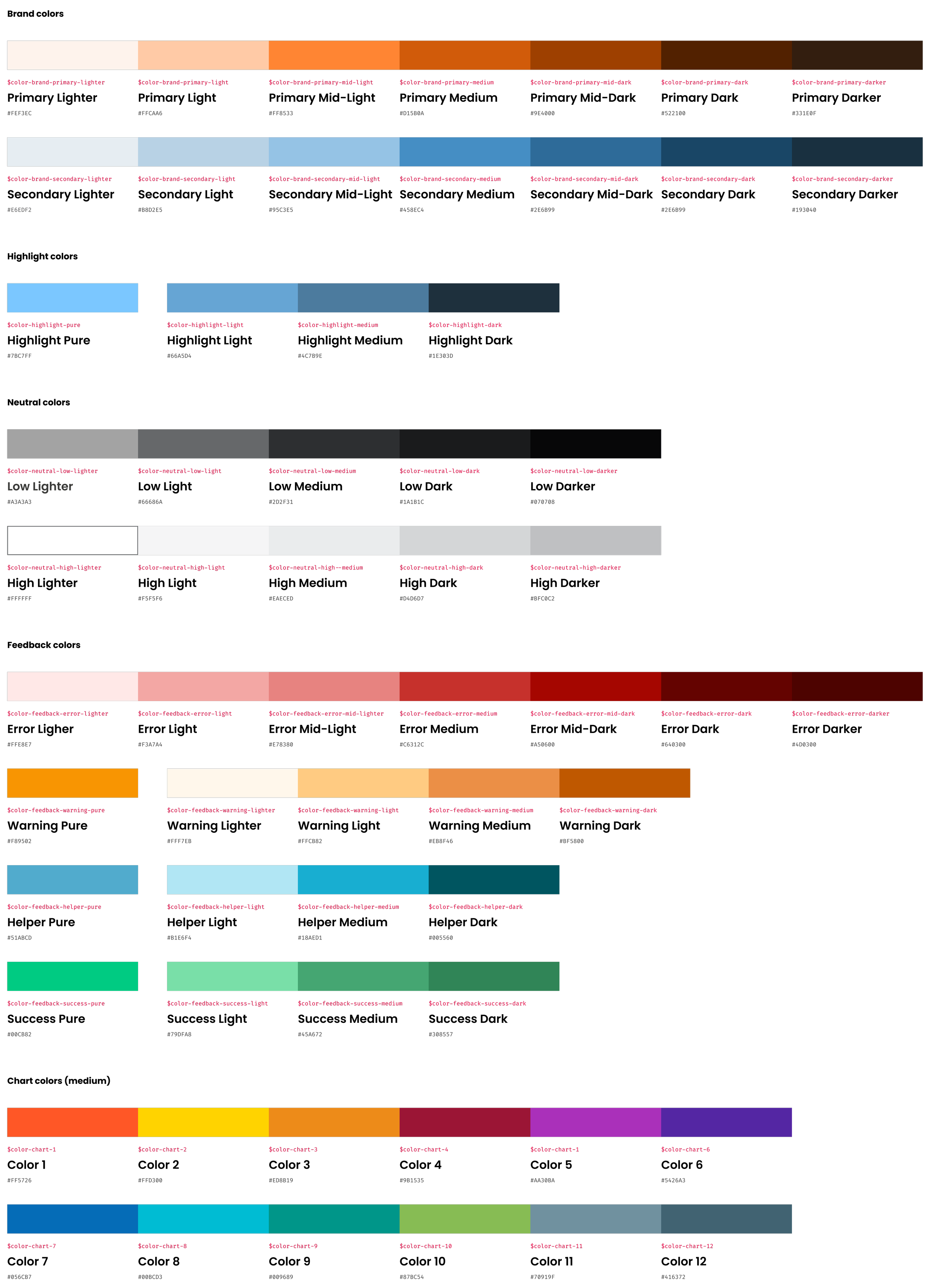
Atoms | Color Palette
Understanding color fundamentals is crucial, as colors subtly influence emotions and actions
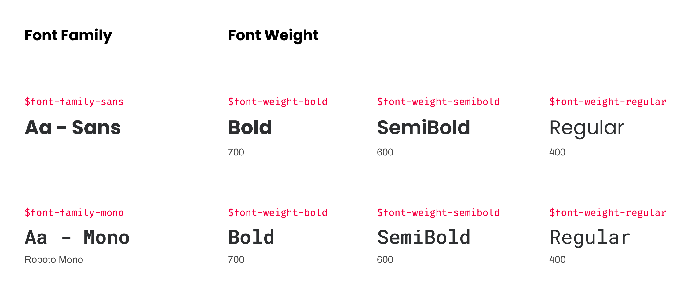
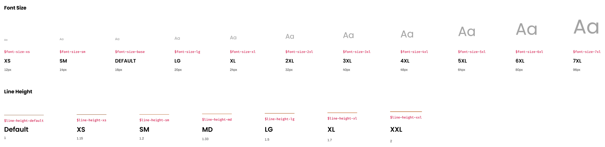
Atoms | Typography
Typography is our system of fonts
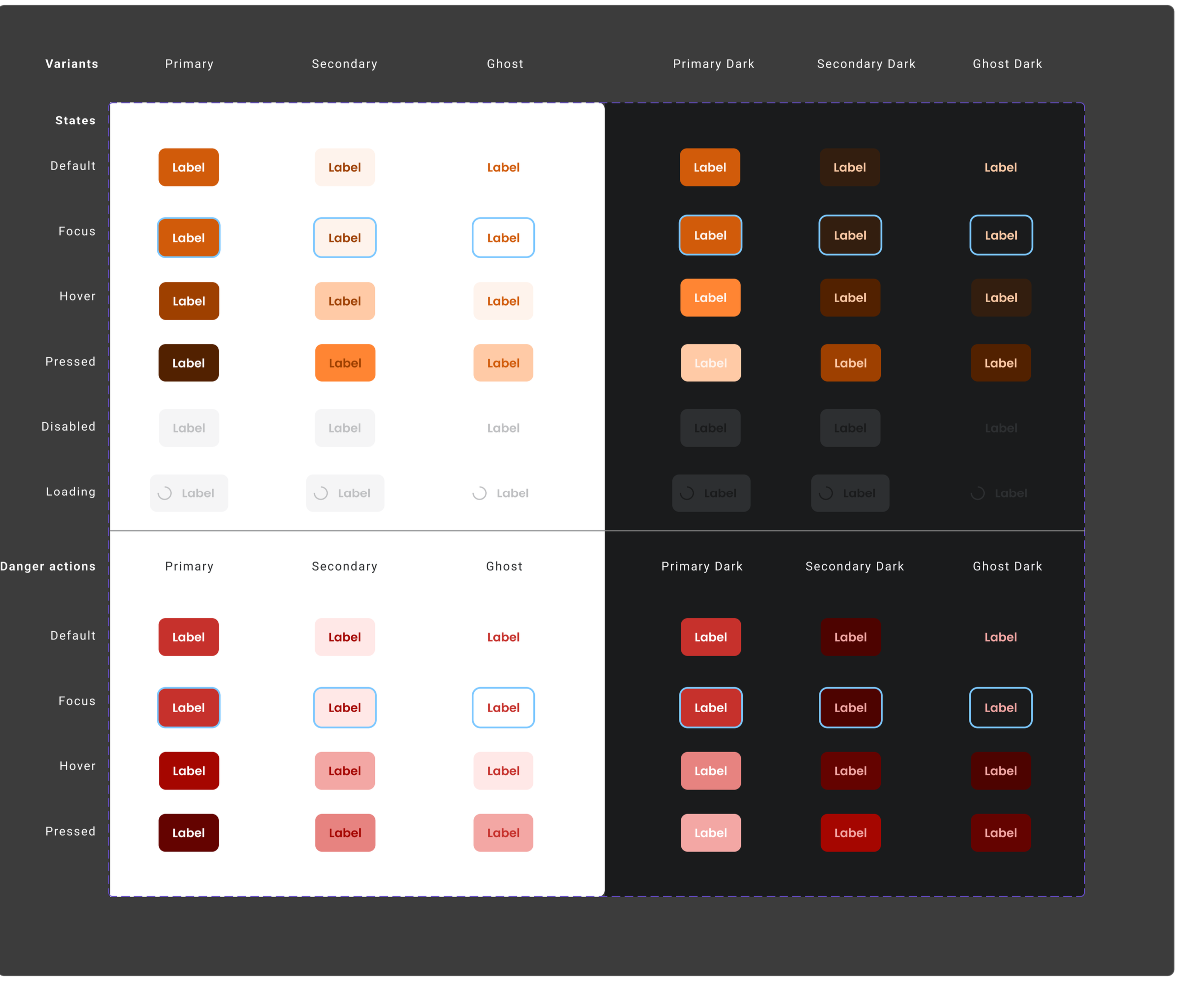
Molecules | Interactive UI Elements | Buttons
Each state of button - default, hover, pressed, and focus - provides feedback, ensuring users are informed and confident as they interact with the interface.
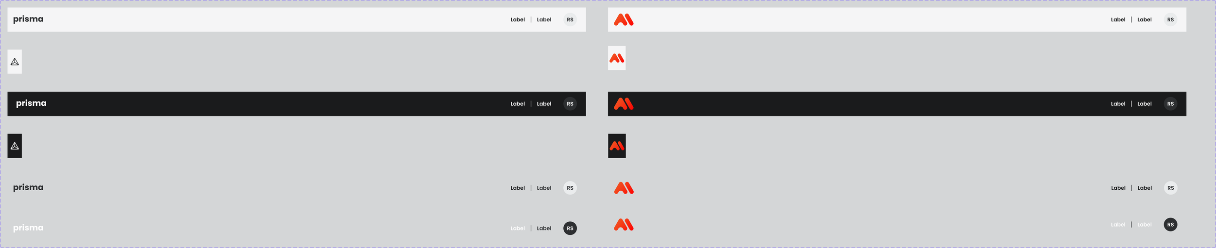
Molecules | Interactive UI Elements | Application Header
A reusable header component that provides global navigation, branding, and user actions — built to work across light/dark themes and multiple product contexts.
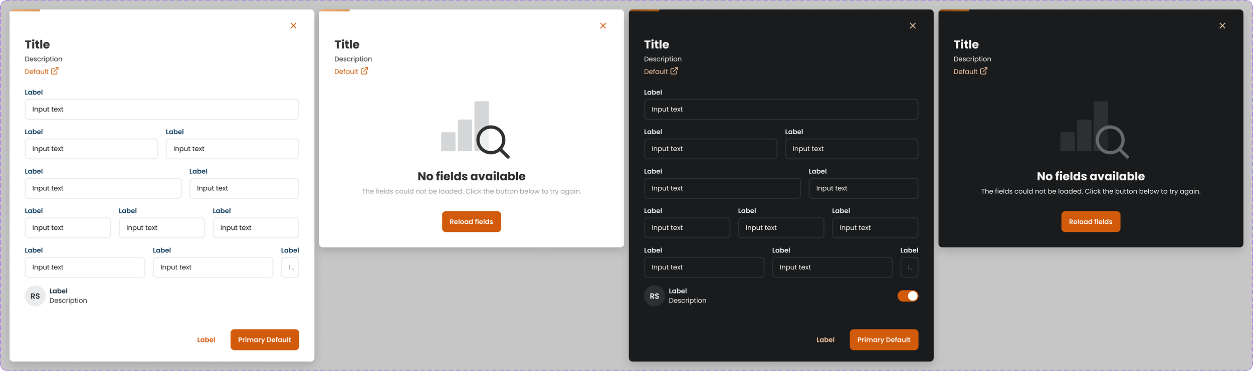
Organisms | Modals
Modals in Prisma act as focused interaction layers, temporarily overlaying the interface to support tasks such as data entry, confirmation steps, or system alerts - while allowing users to return to their previous workflow without disruption.
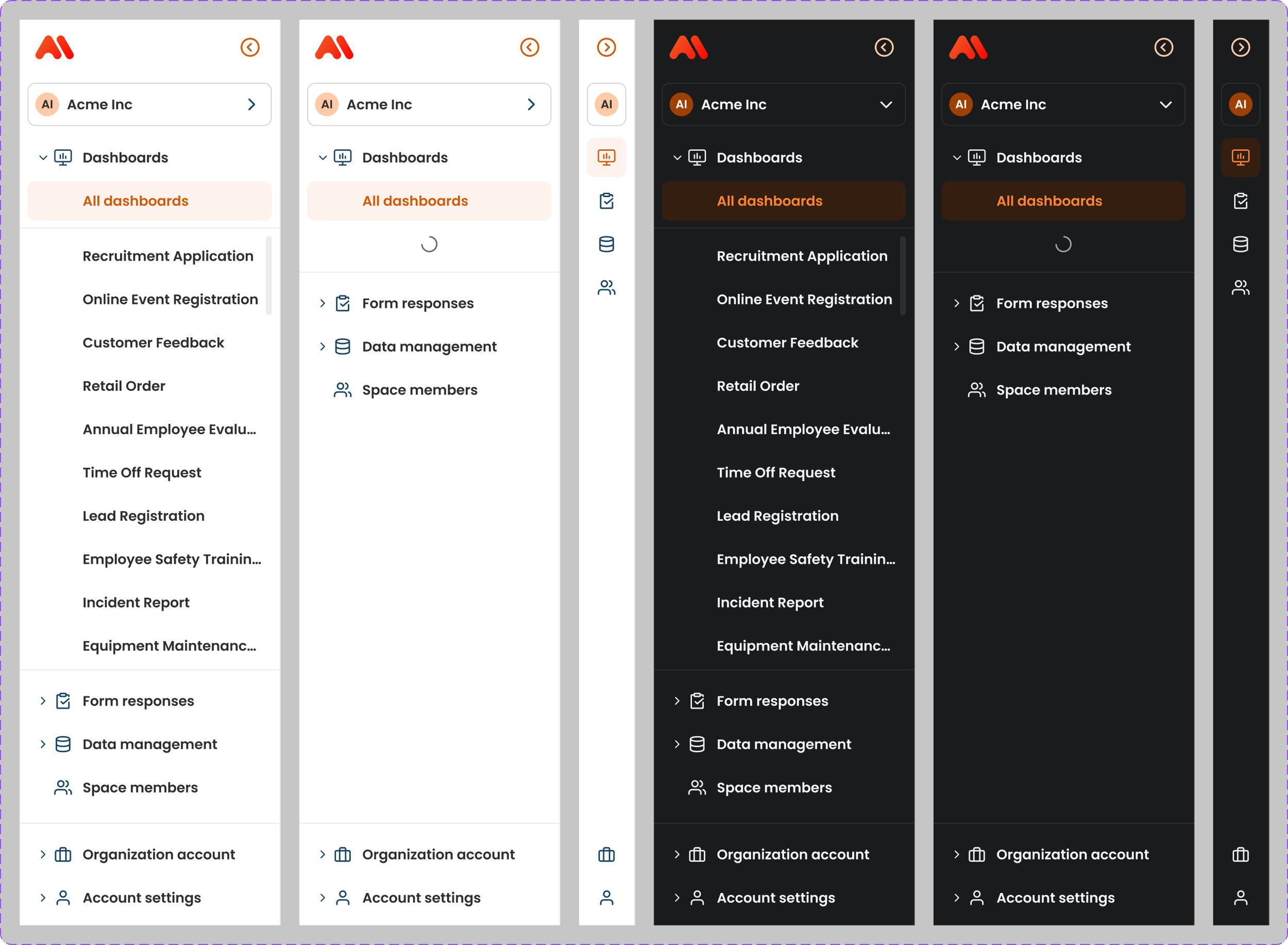
Organisms | Side Navigation
The sidebar navigation in Prisma provides users with quick, organized access to main features and sections, ensuring intuitive navigation and a streamlined user experience across the platform
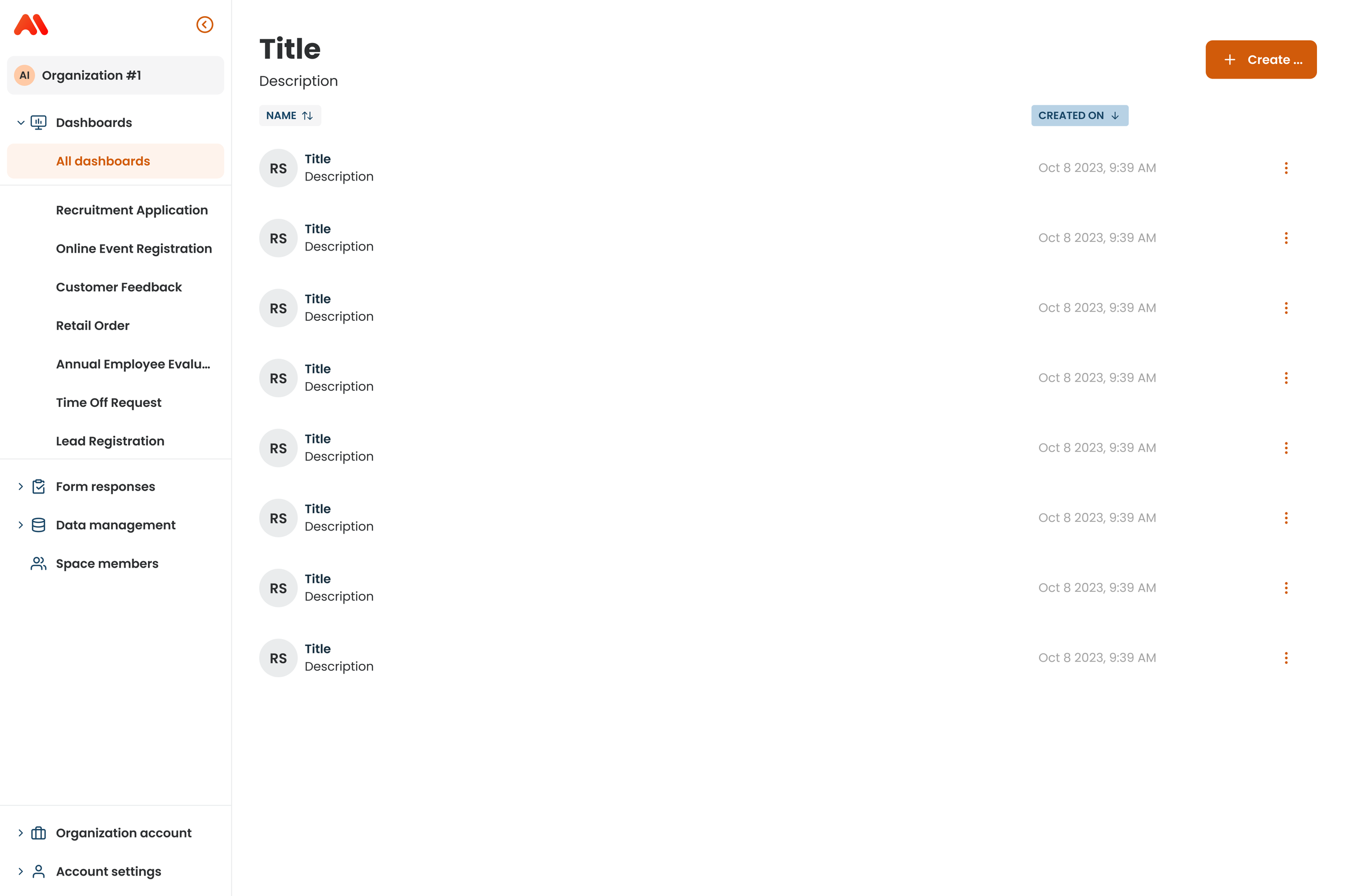
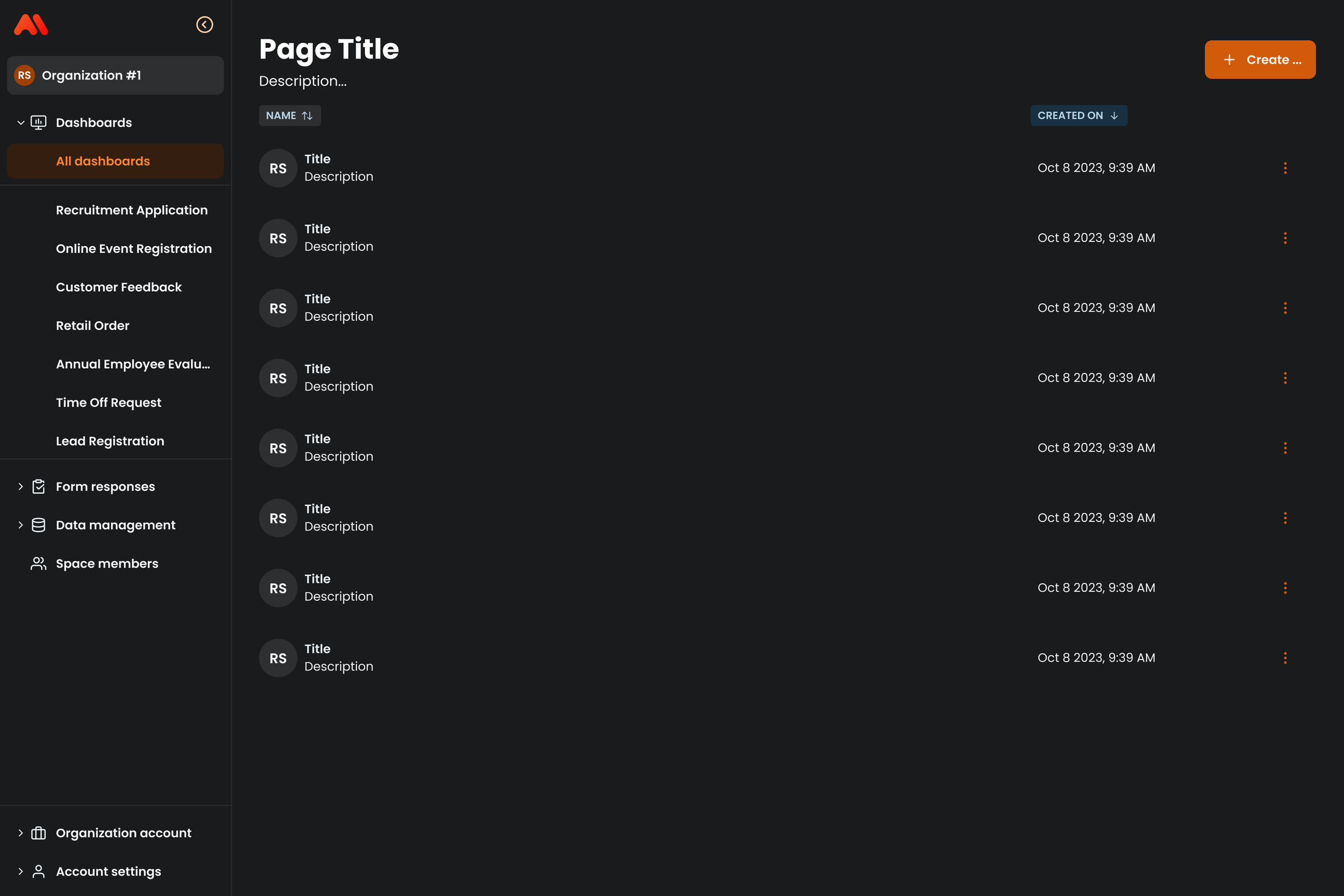
Organisms | Side Navigation
Page templates in Prisma provide predefined layouts that ensure visual consistency, streamline content structure, and create a unified experience across the platform
Outcome
Reduced duplicated UI work by standardizing 60+ components and patterns
Accelerated delivery cycles, cutting handoff time by ~40%
Established a single design source of truth adopted by design + engineering
Eliminated visual and behavioral inconsistencies across product surfaces
Created scalable system architecture that supports future features without redesigning core UI
Chroma turned a fragmented UI ecosystem into a scalable design system — enabling faster releases, higher UI quality, and long-term product consistency.